

My Data Charts
The final data charts for my project checkpoint

You can view these charts in my Excel Worksheet by clicking the link, “DGST101_DataProject”!
Trends I Identified Within The Data
Listing the specific trends displayed within the data charts listed above
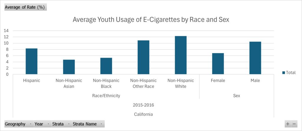
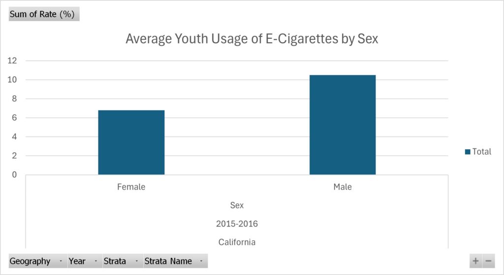
For the data I collected, I chose to inspect trends within the usage of e-cigarettes for the youth. I originally hoped to find some recent research on this done in Virginia. However, I found research done in California instead, and the most recent study I could find was done in 2015/2016. However, I think this is a great state to look at these trends in – since it’s a large state that usually sets many societal trends, including using e-cigarettes. Within the data I collected, I found a trend of white males being the most common perpetrators of e-cigarette usage. I found this data to be extremely interesting, as it defies stereotypes that usually individuals of color are the ones partaking in activities like using e-cigarettes.
The Process for Finding These Trends
The steps I took to find these specific trends within the data
I found this specific set of data on Data.gov! After a lot of research (and figuring out what story I wish to portray) I found this set of data that really pushed the story I wanted to convey – being that the use of what seems like deviant acts (such as using e-cigarettes) isn’t only by individuals of color, thus another reason why we need to steer clear from this stereotype without doing the proper research. After finding this data, I made use of the cleaning process by watching professor Berge’s video in Canvas. I removed the column that displayed the grand total of individuals that partook in the study, as well as the lower and upper 95% confidence interval because it was irrelevant information to the point I was trying to make. Therefore, once I finished cleaning the data, I isolated the different trends I wanted to highlight in their own pivot tables: one for the sex and the other for the ethnicity of youth that partakes in using e-cigarettes. I did all of this using Microsoft Excel.