

Visually Considering My Favicon and Header Images
Why I chose the images that are in place of my site icon and heading for my website
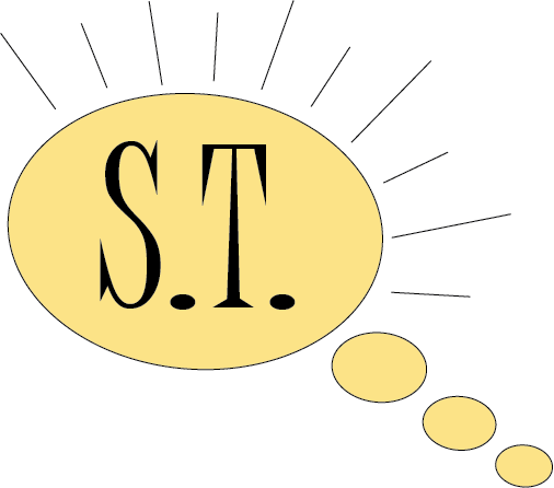
A noticeable difference from previous assignments is the theme of my website. Previously, my site consisted of pink elements. Of course, my website appears quite different now. Originally I made this change because I was unable to edit a site icon (favicon) with the first theme I had chosen. However, I’m quite happy with the change for different, unrelated reasons. This reason blossomed from the creation of my favicon. To explain, while I was brainstorming possibilities for my favicon in relation to my site’s name (“Summer’s Thoughts”), I found that a desperate color change was needed for my theme. To explain, my name was a major part of the correlation, I felt it was only right to add a sunshine somewhere in the favicon itself, thus the color yellow was also added. However, I didn’t wish to have an aggressive, neon yellow but rather a modern, light and breathable yellow that’s more appealing to the eye. Therefore, it was only convenient to make yellow the primary color, this way the website is cohesive throughout.
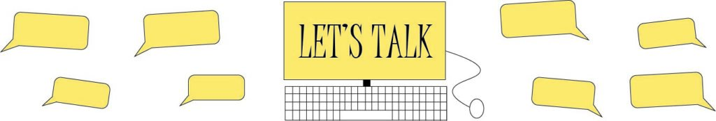
Considering this, I then created lines of a sunshine around a thought bubble for the favicon – quite literally illustrating “Summer’s Thoughts”. Creative? Probably not a whole lot, but the favicon compliments the contents of the website – and that’s the main goal. Sometimes less is more in these cases, thus to ensure that the message you’re trying to communicate doesn’t get lost. Take the favicon for WordPress itself for example. This same principle holds true in the image I created for the header of my website. Reflecting further, perhaps the concept of the header is slightly different from the favicon. I wanted to continue the idea that this website is my “thoughts”. However, I also wanted to communicate the concept that although this website contains my thoughts, it doesn’t mean that it’s “my way or the highway”. Furthermore, as someone who is an advocate for openness and collaboration on the internet, my website should be no exception. I want my website to be home for open and non-judgmental communication that allows all different thoughts, ideas, etc. Therefore, although this is “Summer’s Thoughts”, let’s now talk about them together! Thus, the header image was born. I continued the visual element of the thought bubble, but upgraded them to not only thoughts, but conversations with speech bubbles. However, since there wasn’t a lot of justification for adding a sunshine in this context, I instead displayed that same yellow color that appears in the favicon within the speech bubbles and computer screen to continue the “summery” idea.
How My Images Were Born
The process for creating my favicon and header images
Having taken ARTS 104 over the summer, I already had access and a little bit of practice with Adobe Photoshop and Illustrator. Therefore, I felt the most comfortable creating the favicon and header images there. Going a bit out of my comfort zone, I used Adobe Illustrator (usually I begin in Photoshop as it’s a bit more straightforward). However, I enjoyed this creative challenge. Although I’m not sure if it was the consensus to use real photographs, I wished to go with a more interpretative approach by sticking with illustrations instead. I felt using only illustrations allowed the idea of acceptance in not being perfect, therefore further allowing deeper and much more meaningful conversation to take place. In this case, starting with a few shapes in Adobe Illustrator allowed the idea to flourish. As aforementioned, there was a lot of little details I added throughout the two images that allowed them to be the way they are currently (and hopefully to Dr. Berge’s liking – fingers crossed!). According to Cronyxdigital.com, it is best to have all site icons be exported as a .png. This is due to the fact that PNG allows transparencies while having larger file sizes. Diversely, I exported the image for my header as a .jpg. As aforementioned, Cronyxdigital.com says that JPEG is best for websites because it is the lightest file type, which is important as it won’t slow down the website further.